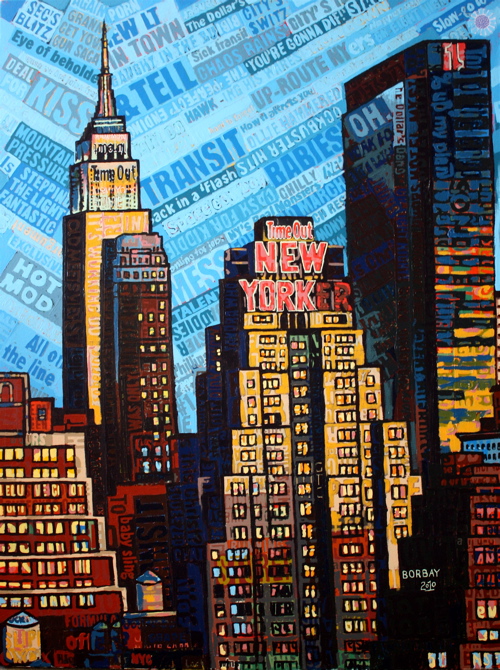
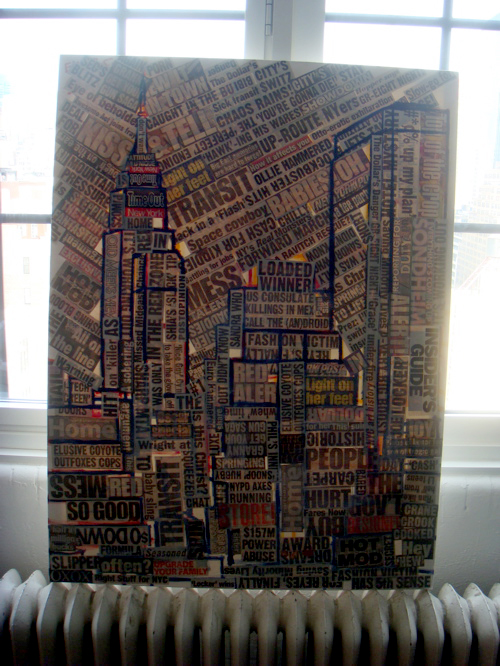
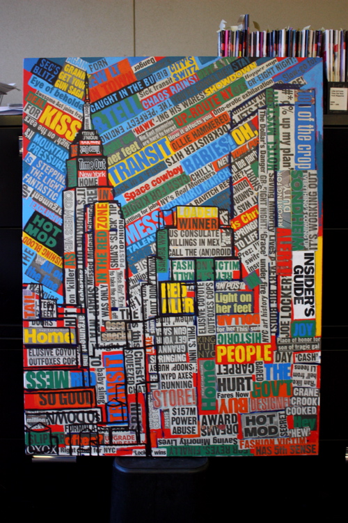
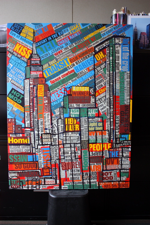
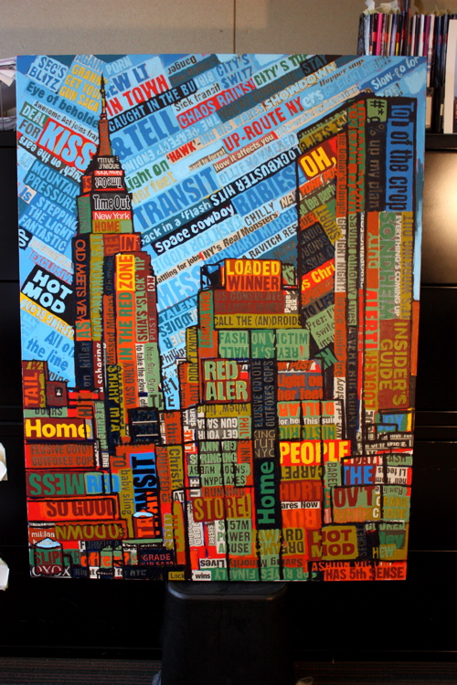
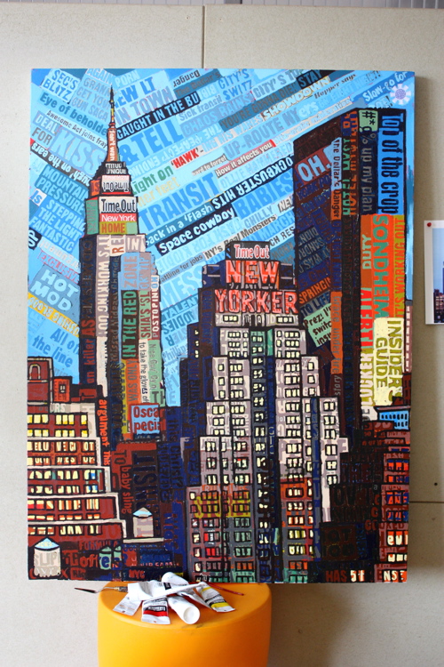
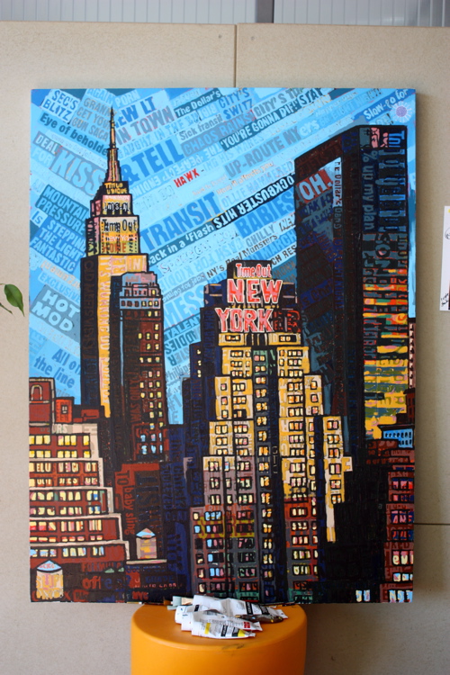
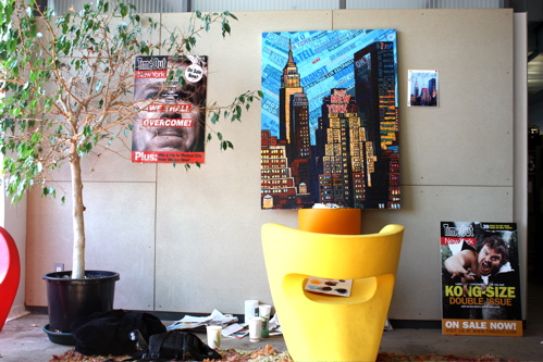
My 3’X4′ painting of Time Out New York‘s 12th story view is now complete. A little back story: After being named Time Out New York’s Most Creative New Yorker (a title I do not sew onto my blazer, but do use to help sell paintings and commissions) – I decided to ask Time Out if I could set up shop, and paint the view from their West Side offices. After getting the go-ahead in December, I broke my leg playing hockey and had to wait three more months.
I assume everyone knows what it is, but for those who don’t: Time Out New York is Manhattan’s Bible; a real-time who, what, when, where, why and how work-in-progress. Were it written in ancient times, “Now Do This” may have steered us towards a manger, where we could drink wine and kick-it with Joseph, learning about carpentry. Being immersed in Time Out’s culture and drinking their coffee is a true experience.
By the way, this painting is now available for acquisition online.
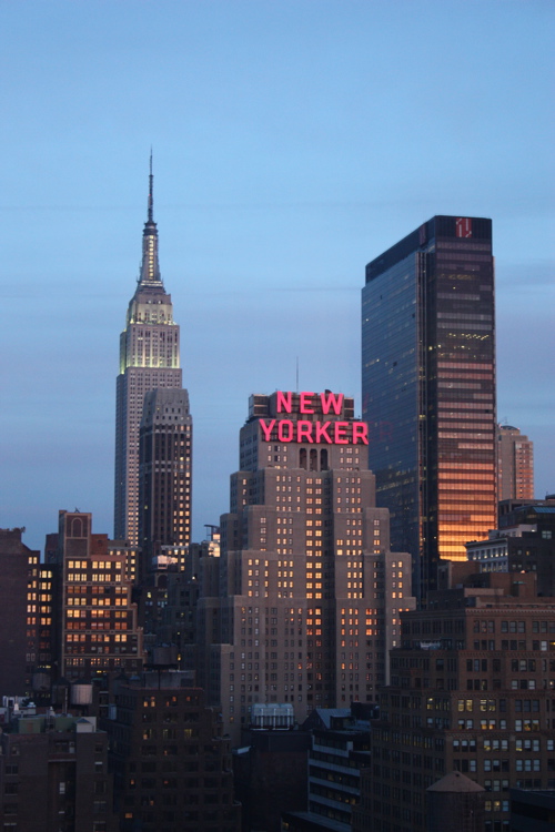
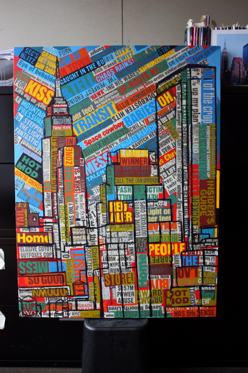
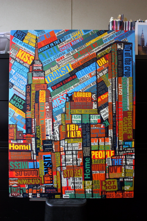
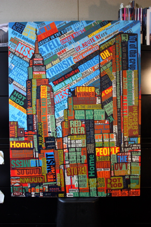
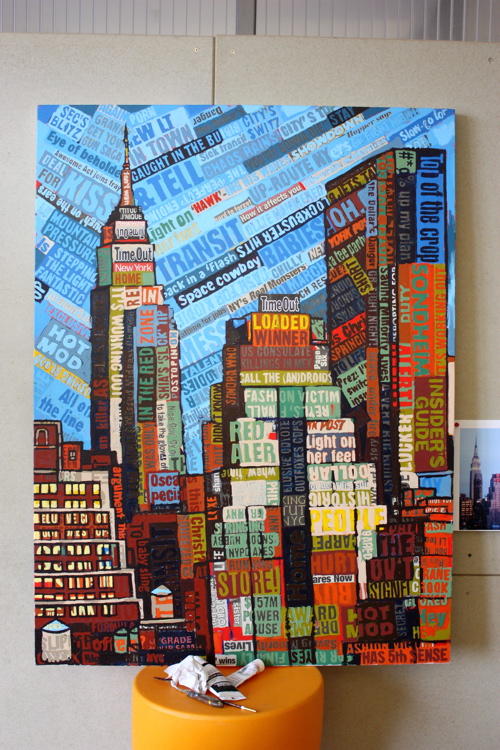
After two sessions, I decided to embrace the view during twilight (the beautiful time of evening, not the Tweenster movie series) – as pictured above. After the jump, each stroke along the way.
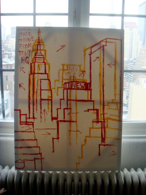
Set up right next to the window, propped up on the heater, getting a one-to-one view to canvas vantage point.
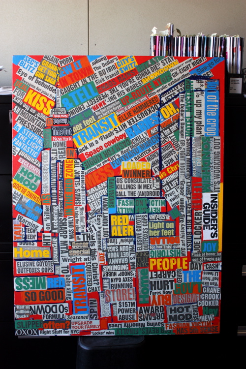
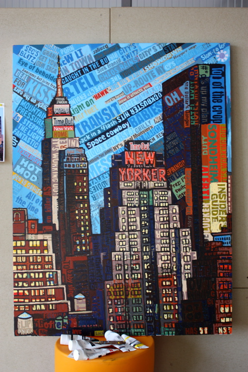
Quickly blocking out the image in yellow, straight from the tube.
I quickly realized I hacked-off the spire of the Empire State Building, which is a Class Two felony, so I took a second go with red and finally found my piece-de-resistance.
While off-center, I wanted the Empire State to be the focal point, so I began collaging my carefully trimmed New York Post headlines with a vanishing point located somewhere around Nassau County.
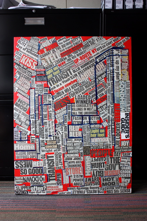
A round of dark blue outlines to help keep the directional collage work focused.
Yar, the entire surface is covered, like barnacles on the hull of a seaworthy vessel.
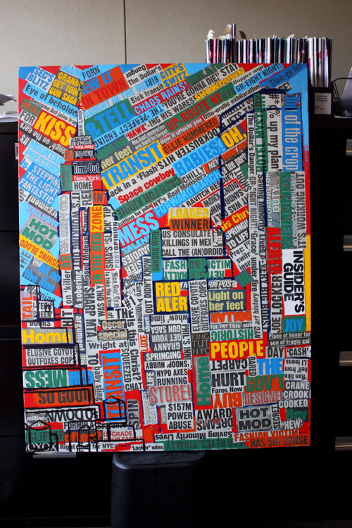
As is customary, the first round is a deep red… working it throughout the canvas to create balance, and red areas throughout.
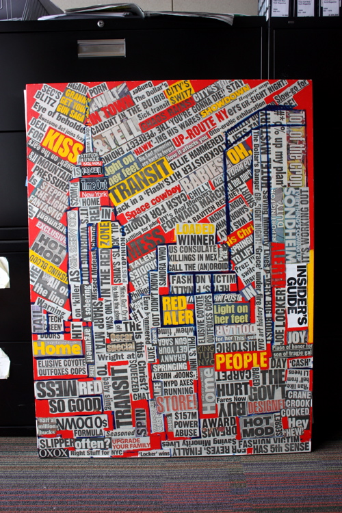
Next-up is yellow, playing with the placement, watching how red and yellow interact.
And blue to complete the primary triad.
Moving into the second round, a cycle of orange… which can make red feel lost, and blue feel like the loathsome New York Knicks.
A deep, dirty green.
We gotta rock down to, an electric blue, and outlines make you higher. Oh no. Oh no.
Continuing the outlines, to help redefine the space… in deep purple. Secondary triad, donezo.
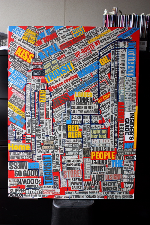
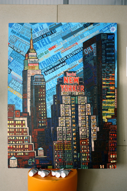
Working the Time Out New York logo into the Empire state, as well as some teal blues. And here is where the canvas lies after two sessions. Up next… finish the outlines, work another six color cycle, and begin to focus on the luscious twilight… light.
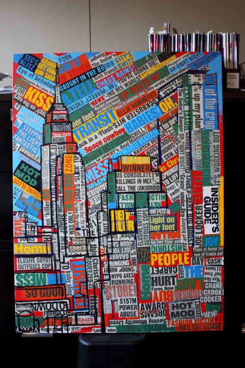
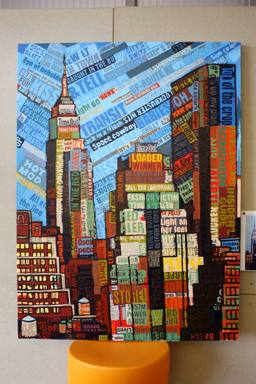
Kicking off yet another day of painting by finishing the primary building outlines.
What’s that? Holla! Puke green in the house son, what?
Nothing more satisfying than some deep, deep purple. It’s so deep.
Some nice, reflective, minty green.
Toasted pumpkin, spread throughout. Separate aside, there is a woman who does operatic voice drills every day in the unit above me, I can hear her through the walls. To the untrained ear, it might sound like she is getting stabbed or off…
Selecting a strong, deep shade of burnt umber, beginning to fill in the darker planes.
Always taking some time to work the sky… adding in the first real light of the canvas. An off white mixed with red, blue, white and yellow.
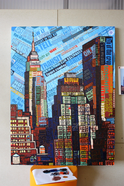
Here is where the push to the finish begins… starting with the building in the foreground. Since the Empire State Building and New Yorker signs are the prestige points, I wanted to focus on the foreground minutia before diving into the fun.
Adding bright yellow to windows really make them pop.
Shifting over to the opposite side, hacking into that foreground building.
Ah yes, starting out with the New Yorker …
Adding in a purple-ish red mix to create reflective light, almost, a deadened light.
Working the skinny building closest to the Empire State, which is nearly blacked out, like a 19 year old celebrity at the Waverly Inn.
Getting to business on One Penn Plaza.
Refining, splashing colors, outlining the New Yorker sign, with modification to emphasize the Time Out shout.
Getting so close I can taste it… the paint tubes are already hanging out, drinking beers.
Adding subtle splashes of color and reflections.
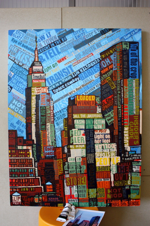
Game, set, match.
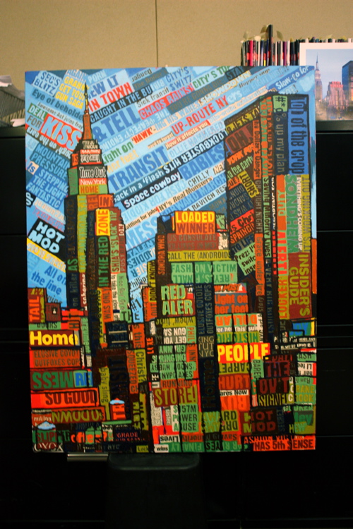
A view after a few days of work.
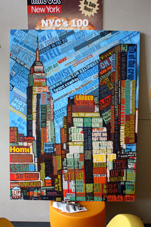
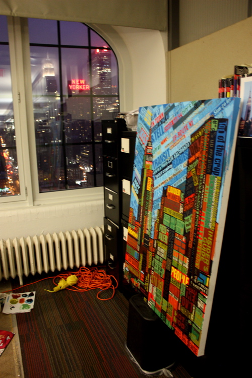
The final piece in context with its surroundings. Working at Time Out New York has been a blast. My painting will hang out there for a while, soak up the good times, and will be on shown downtown in a few months (stand by for details.) I want to thank Cristina Velocci for getting me introduced to Nina Topiel, who was amazing in allowing me to set-up shop. Everybody treated me like part of the team, and I was pleased to get to know some great people, like Marc Whalen, a crazy talented artist himself; Nicola, John, Lindsay and John. I greatly appreciate the shouts by way of Time Out’s Twitter and Tumblr accounts, and look forward to staying in touch with the entire team.









Once again Jason, you amaze me every time. Can someone please tell me why this man is not nationally famous yet? Amazing stuff
If I scroll fast enough, it’s like time-lapse, watching from over your shoulder! Thanks for sharing the process, I would’ve been wondering how you set up the headlines in the composition otherwise. Love the color vibe.
@Drew: Thank you, and congratulations for becoming my publicist. ; )
@Petra: Great to hear from you and thank you for the compliment, means a lot coming from such a talented painter.
I love it! And I love the style…I think I’m finally starting to get it, too. When I look back at the previous pieces, it’s like I see something new each time. Historically, this will be seen as one of the great “periods” of your artistic career.
Amazing!! I’m trying to paint it in acrylic paint but I’m a beginner so I don’t know how it will be… hahhah
Hi Raquel, thank you for the shout — most appreciated. If you ever have any questions, please don’t hesitate to reach out: jason at borbay dot com. I prefer to use Liquitex Heavy Body acrylics… they are rich, textural and more opaque than the normal density of acrylics (or, at least, I’ve found).